Close

Overview
Forum One is a digital consultancy helping the world's leading organizations to make an impact on important issues. They provide digital strategy, communications, design and UX, data and analytics, and technical development for clients spanning the Gates Foundation, NRDC, AARP, the March of Dimes, and government agencies in Colorado, Washington state, and federal agencies, including US EPA, USAID, Peace Corps, HHS, and others.
Highlights
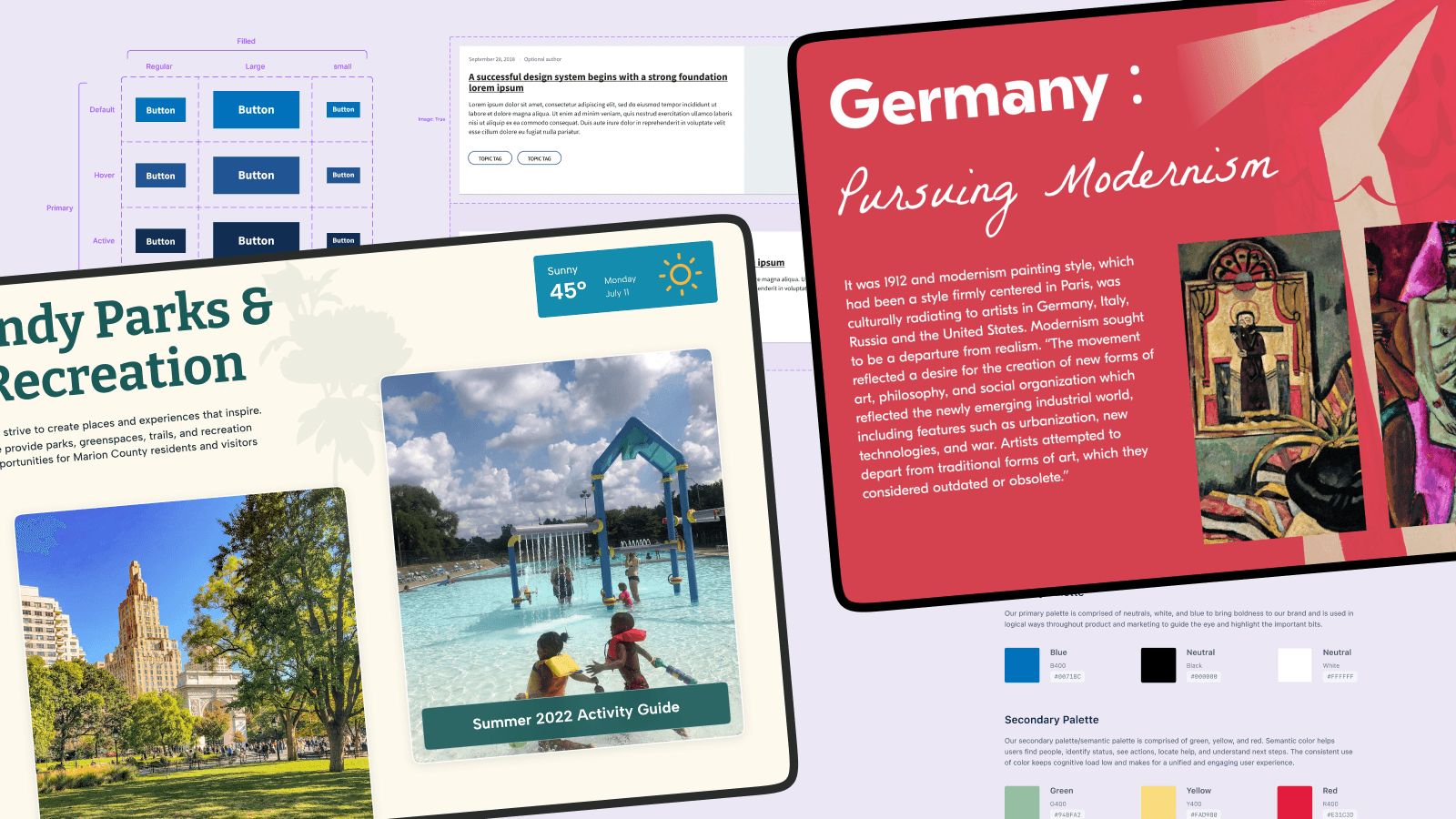
Created visual concepts for the Vilcek Foundation and Indy Parks & Rec websites which were valuable to UI designers.
Streamlined the internal design system process by creating a starter template in Figma, leading to increased efficiency for both designers and developers.
Analyzed audience interviews to create user personas and improved information architecture of Texas Higher Education Board website.
Created a reusable design system template in Figma that can be duplicated and customized based on different projects. Resulted in increased efficiency for both designers and developers and 10+ hours saved per project
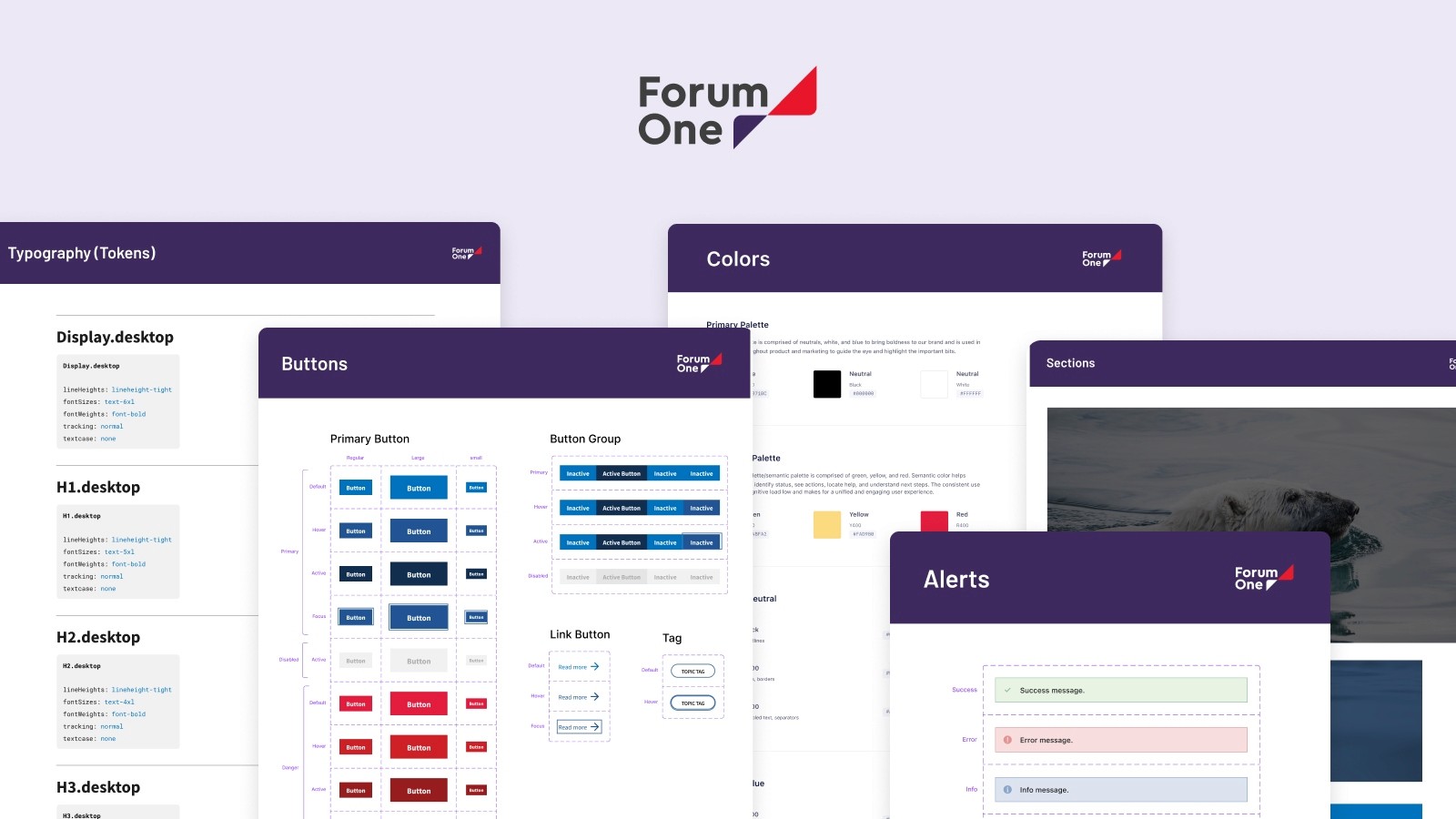
The Challenge
The teams at Forum One had been struggling with a consistent design system that could be used across different projects. As a result, the tech team spent too much time coding the same elements and functionality for each project. Also, the design team spent too much time creating wireframes that could be made quickly using a design system template.
Time Frame
2 Months
Team
Rachel Feltes, Project Manager
My Role
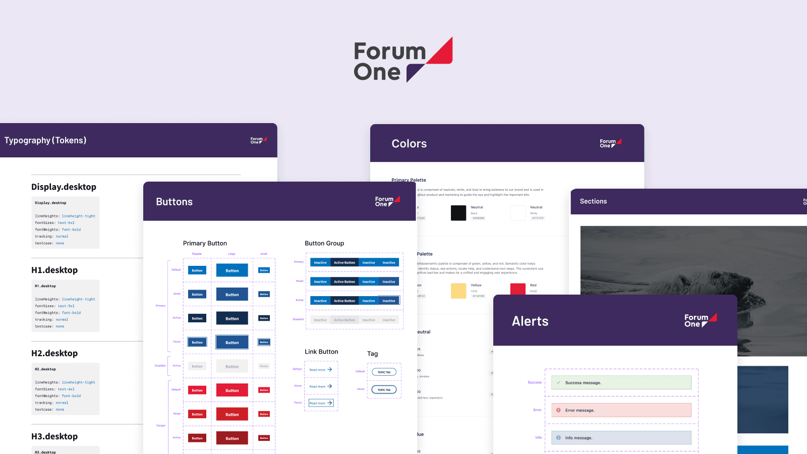
I was assigned to create a starter design system that can be used as the foundation for all their projects. This starter design system will include a style guide, components, patterns, and Figma guidelines that can be quickly tailored for each individual project.
Understanding the team goals
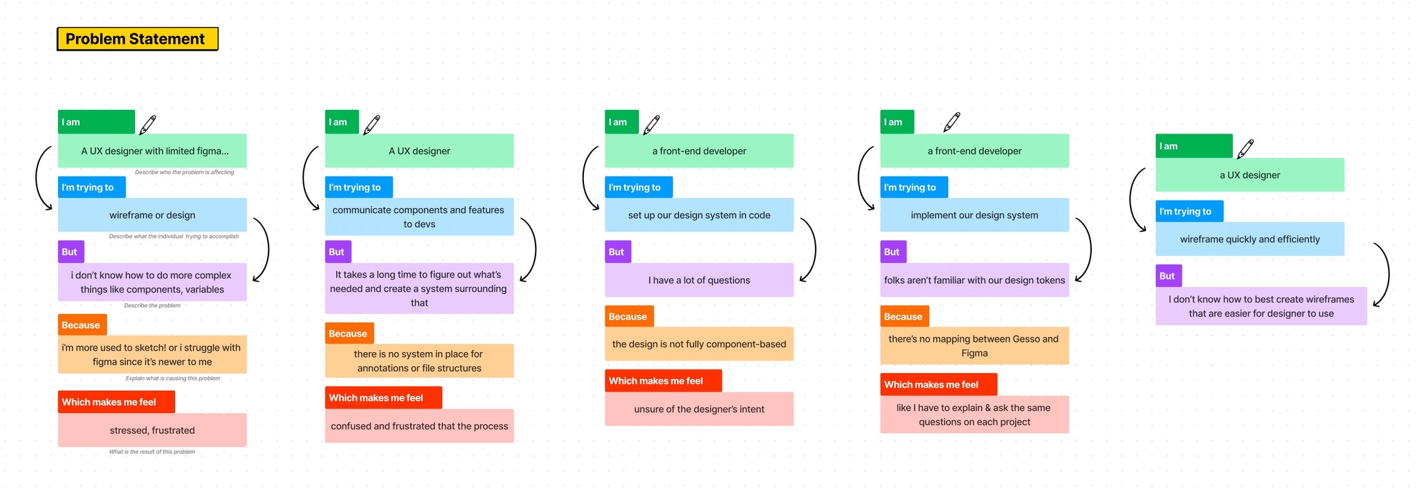
I conducted a workshop with some of the team's designers and developers to understand better their pain points and what they expected from a starter design system. I wanted to map out the solutions to the problem statements and better align myself with team goals.
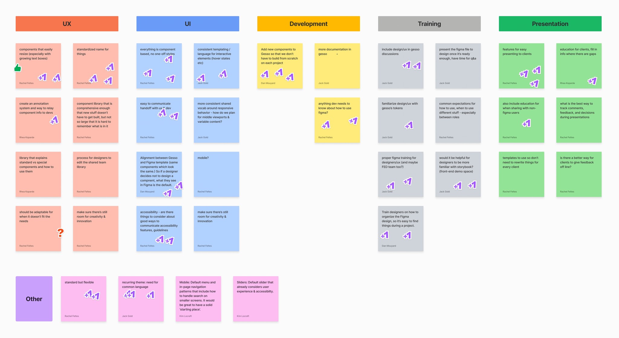
I also organized a brainstorming session to get everyone's ideas across and create a starter template that as many team members could use. While everyone had great ideas, I wanted to prioritize them, so I asked the team to upvote the ideas they thought would be more beneficial so I could tackle them first during my internship.
Implementation
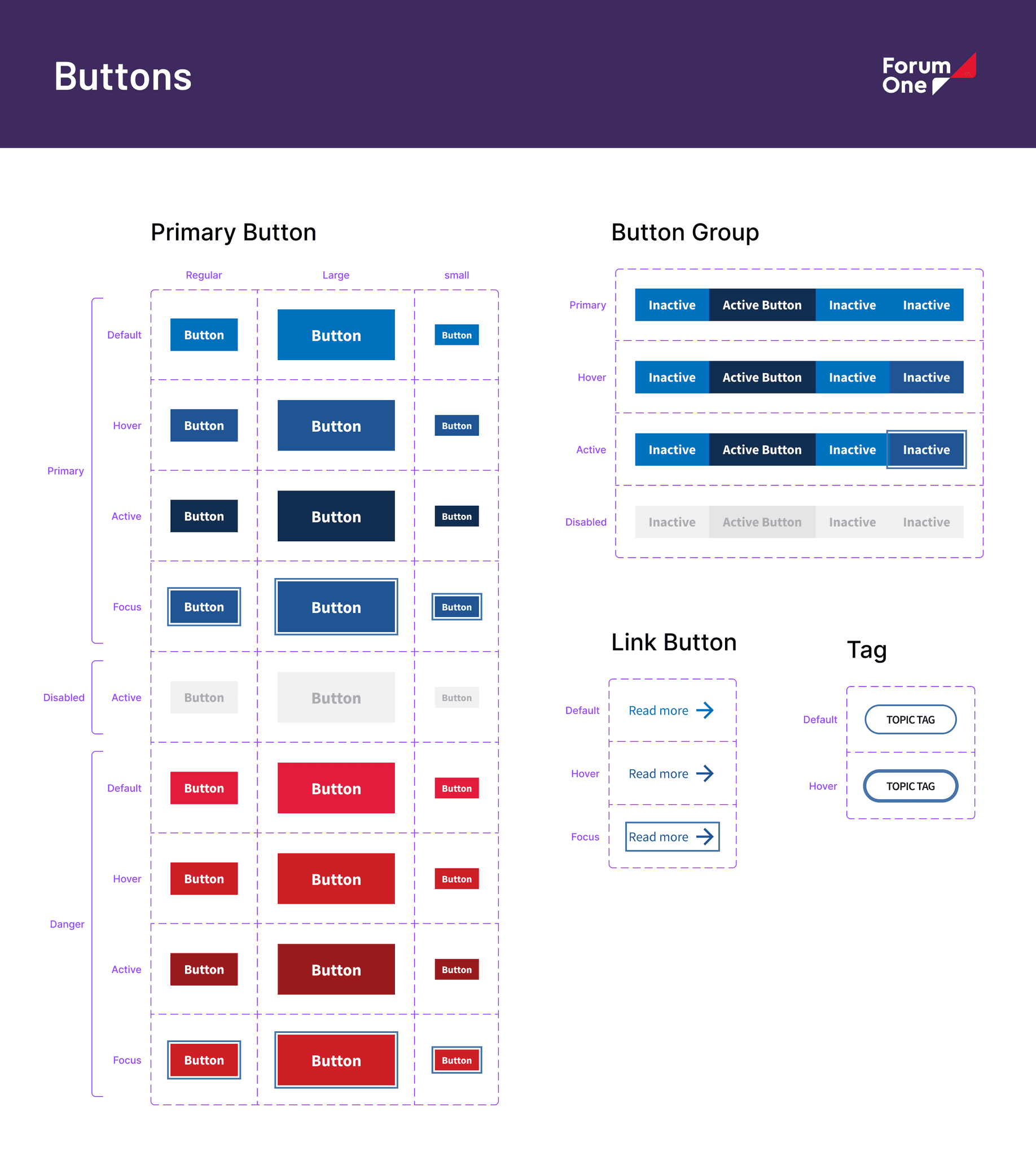
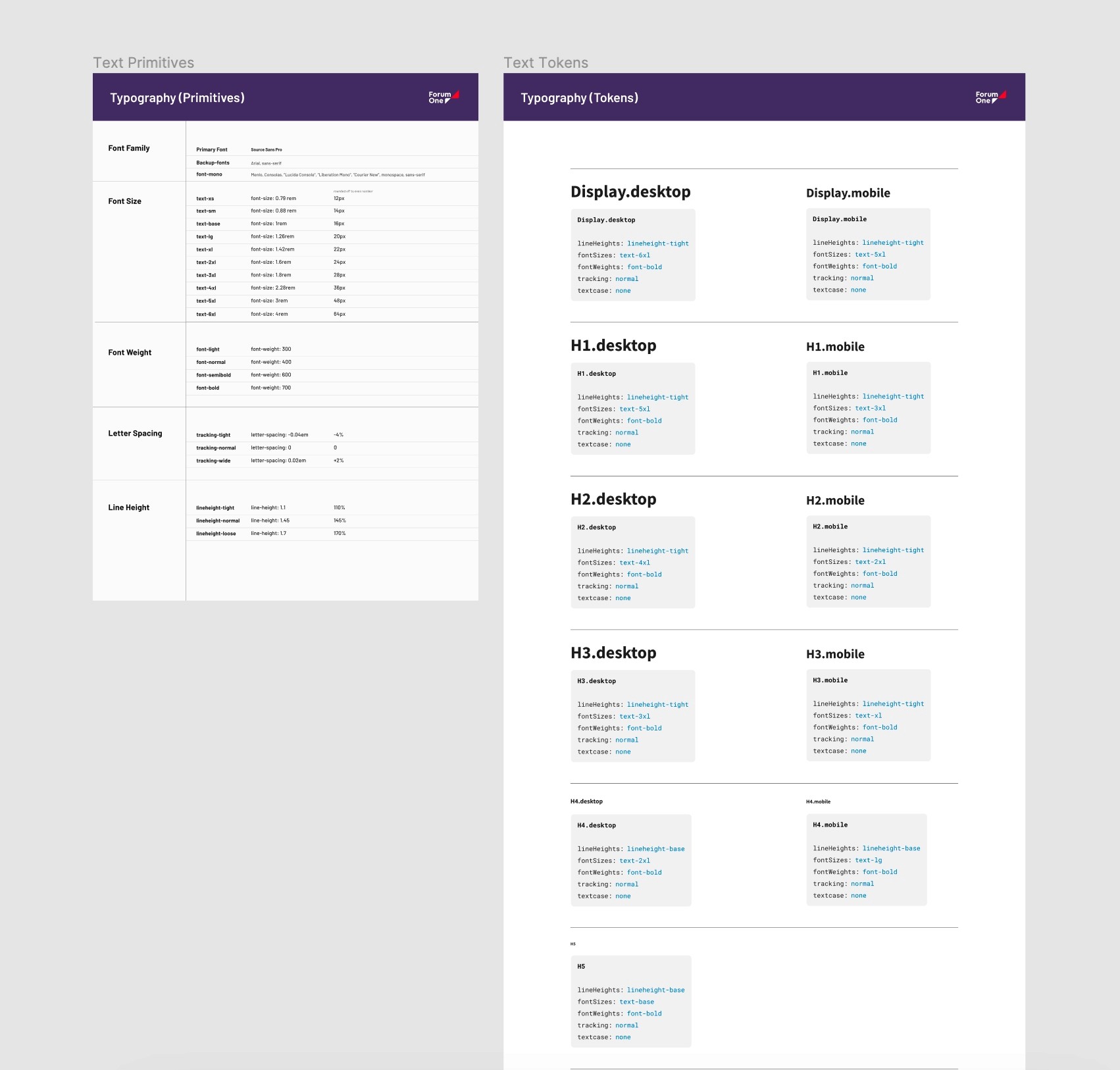
After researching and examining countless organizational design systems online, I started gathering the components and patterns most often reused across all of Forum One's projects. This included essential elements like font sizes, colors, and button styles. I also worked on creating a set of guidelines that all designers should follow, such as keeping design elements consistent and avoiding unnecessary complexity.
Component Library
I then began creating a library of components and patterns that could be quickly implemented into project wireframes and are supported by WordPress and Drupal. This library included all essential reusable elements that could be used across projects without having to be recreated for each one.
Scroll ↔︎

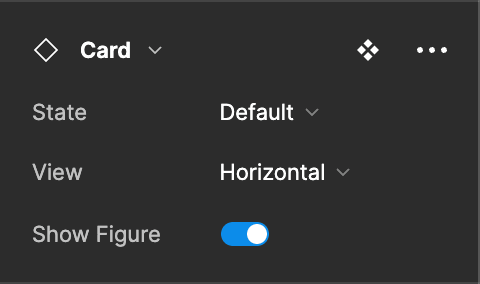
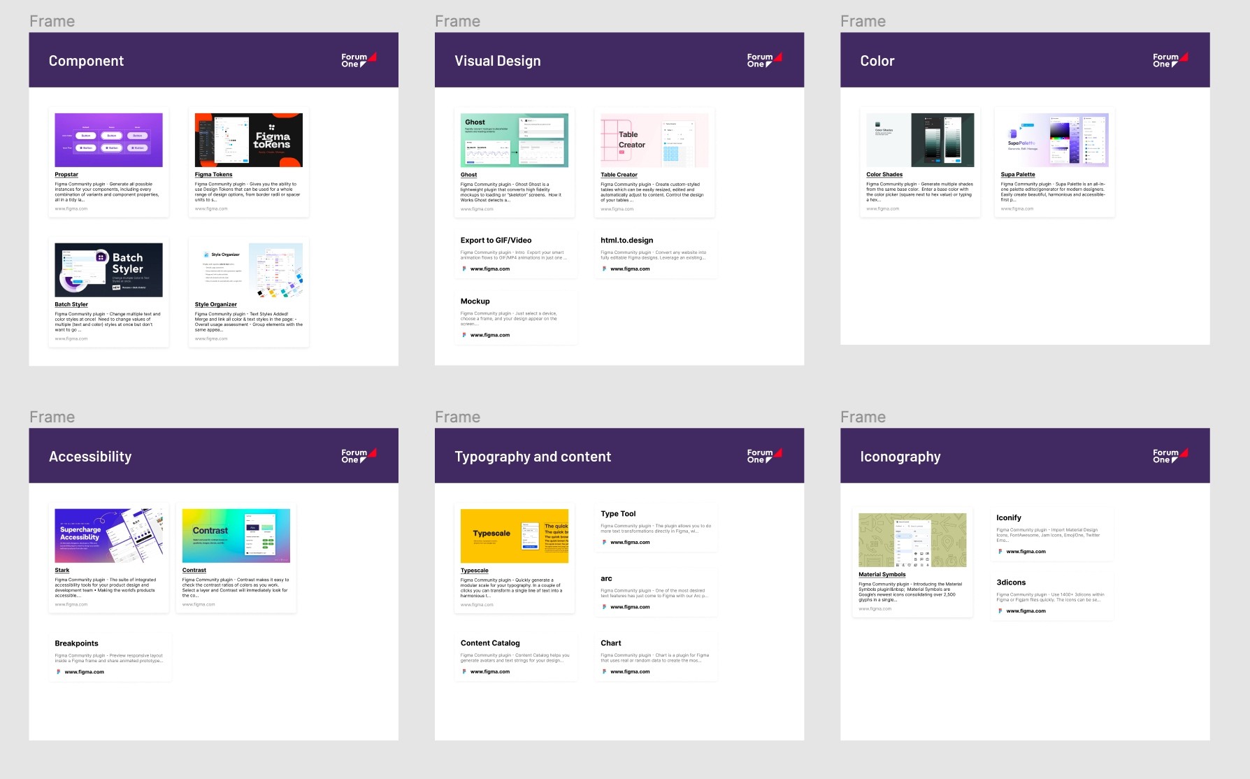
Information about plugins, widgets, and design systems to help the team become more efficient and collaborative
Visual Concepts
Additionally, I assisted the UI Designers by developing visual concepts for client meetings
Reflections
Creating a well-rounded design system is no easy feat and requires input from a variety of stakeholders from across the organization.
It's important to keep in mind that design systems are living documents; there should always be room for creativity and new ideas.
I've gained a strong understanding of various industry methodologies aimed at understanding and empathizing with users during audience research and UX design.
Visual concepts are paramount for understanding a client's expectations and setting the tone for a successful project.
